Ever wonder why the image you pulled from your website doesn’t look good in print? It all comes down to correct image resolution.
To ensure your printed images look clear and crisp, your image resolution should be at least 300 dots per inch (DPI) at the final output size.
Take a look at these examples:
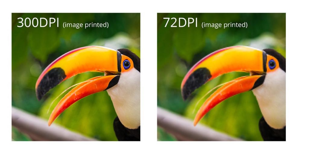
The image on the left is an example of a low-resolution photo or 72 DPI. This is how an image from your website would look printed. The image on the right is a high-solution photo or 300 DPI. This is the image resolution you want for printing.
Caution: You cannot simply convert a low-resolution photo to a higher resolution by increasing the DPI in your imaging program. The printed result will be a blurry image.
Resolution is also known as PPI or pixels per inch. It is a measurement of the number of squares (or pixels) of color information available in an inch of space. The more squares, the better the image quality. Below is an illustration of how the same image might appear at different pixel resolutions.
CMYK (or process color) is the color mode used in commercial printing to create full-color graphics and images. The process involves combining varying amounts of cyan (C), magenta (M), yellow (Y), and black (K – for “key”) ink to produce the full spectrum of color.
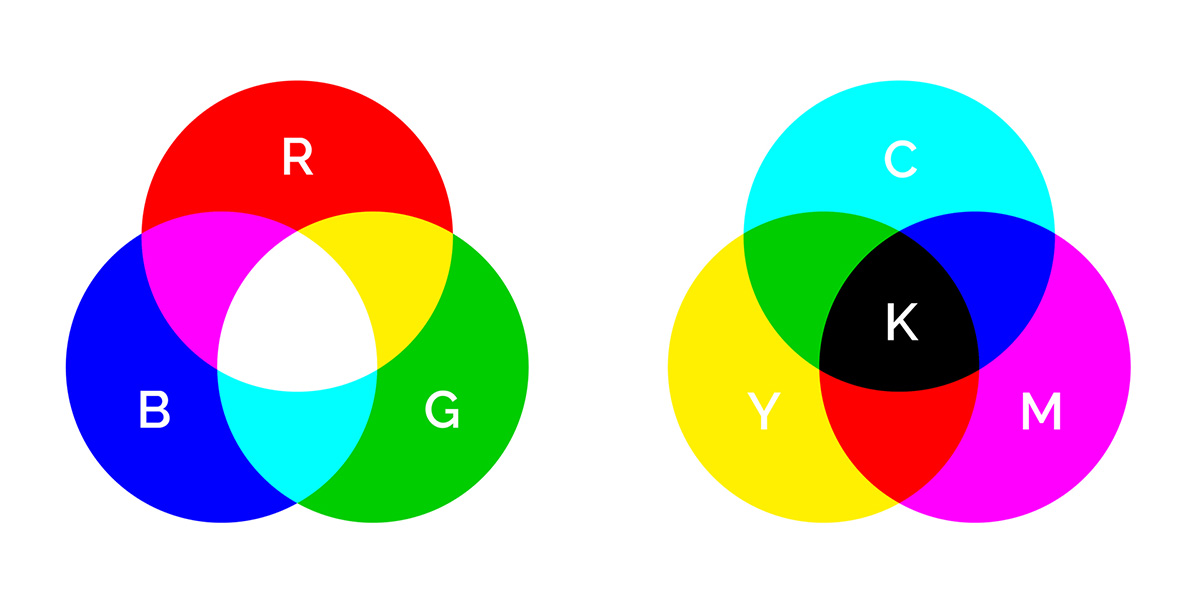
The other color mode you’re probably familiar with is RGB color. RGB uses three colors: red (R), green (G), and blue (B) to create a full-color effect.
For best results, when designing your artwork for print, start with CMYK color mode. This will help ensure your images and background colors look great from the start. Of course, you can create your artwork in RGB, but then it will have to be converted to CMYK after the fact.
While most colors translate pretty well from one color mode to the other, subtle color shifting is common when converting from RBG to CMYK (and vice versa), requiring some manual adjustments to get things just right.
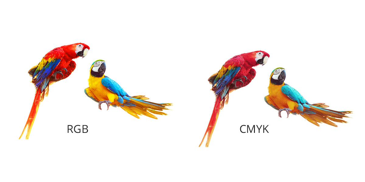
Take a look at the image above. Do you notice the slight variations from RGB to CMYK color modes?
Other examples of this include how many software programs will translate a 100% blue RGB value into a CMYK color that looks more purple than blue. Such changes will need to be accounted for if you start with an RGB color mode and then convert to CMYK later on.
If you send us files that use RGB color, we will convert your files to CMYK before printing them. In such cases, we recommend you view a printed proof before we complete your order, so you can see how the converted colors will appear in print.
For information on setting up your files to use CMYK color, visit our application-specific instruction pages.
Converting Images in Adobe Photoshop
If you’re using images from a digital camera or your phone, those photos are most likely using RGB color. Here are the steps to convert an RGB image to CMYK color using Adobe Photoshop.
- Create a copy of your original image and open both in Photoshop. This will provide you with a point of reference to look back on once you’ve converted your image to CMYK.
- Choose the copy you want to convert and select Image > Mode > CMYK Color from the main toolbar at the top of the screen. This will convert the image to CMYK.
Referring back to your original image (still in RGB mode), adjust the colors as needed. In most cases, Photoshop will do a good job converting the file, but subtle adjustments may be needed.
For best printing results, keep these in mind:
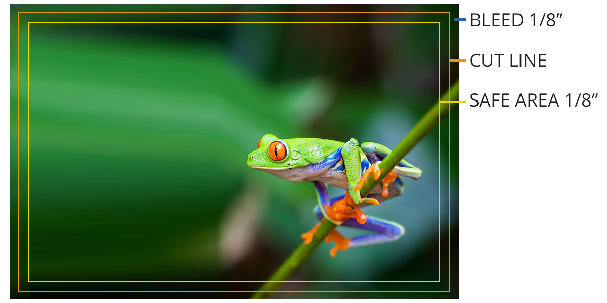
- Bleed Line: Artwork is extended to the solid, green line.
- Cut Line: The orange line indicates the edge of the finished, printed document.
- Safety Margin: Remember to not place text into the beyond the blue line because it could get cut off in the trimming process.
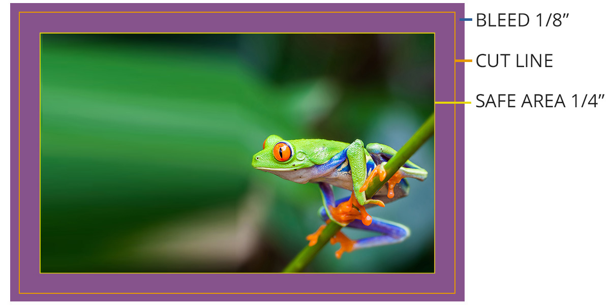
Borders With Bleeds
The actual edge of a trimmed piece can vary by as much as 1/16″ from the planned edge of the page. A “bleed” area is used to compensate for this variation.
If your printed piece calls for a border along its edge, you will need to extend that border 1/8″ beyond the outside cut line, in order to ensure that it prints properly. Otherwise, you might run into issues when the piece is cut to its finished size.
We recommend a minimum border width of ¼” inside the cut line, plus 1/8” of extra thickness beyond the cut line for a total width of 3/8”. A ¼” border with a 1/8” bleed will ensure that the print piece looks clean, sharp, and symmetrical when it is trimmed.
If your artwork contains vector-based graphics with transparency or other special effects, you’ll need to make sure to provide us with a copy of your files with flattened images and all fonts converted to outlines. Transparent, unflattened artwork and non-outlined fonts may not print properly, resulting in costly delays and reprints. Below are instructions for flattening your artwork and converting fonts to outlines in Adobe Illustrator and InDesign.
Adobe Illustrator
Create a copy of your file and save the original in a safe place (in case you need to make changes later). Once you’ve flattened your images and converted your text to outlines, you will not be able to edit those elements again.
- Working from your copied file, select all the layers in your document (Ctrl-A or Cmd-A).
Choose Flatten Transparency from the Object menu.
![]()
- Check “Convert All Text to Outlines” and “Convert All Strokes to Outlines” in the Flatten Transparency dialog box.
- Uncheck “Preserve Alpha Transparency” and “Preserve Overprints and Spot Colors.”
Save Adobe PDF Preset as “Illustrator Default” and select Acrobat 6 (PDF 1.5) from the Compatibility drop-down menu.
Adobe InDesign
Create a copy of your file and save the original in a safe place (in case you need to make changes later). Once you’ve flattened your images and converted your text to outlines, you will not be able to edit those elements again.
- Working from your copied file, select all the layers in your document (Ctrl-A or Cmd-A).
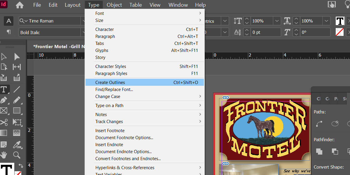
Choose Create Outlines from the Type menu to convert your text to outlines.
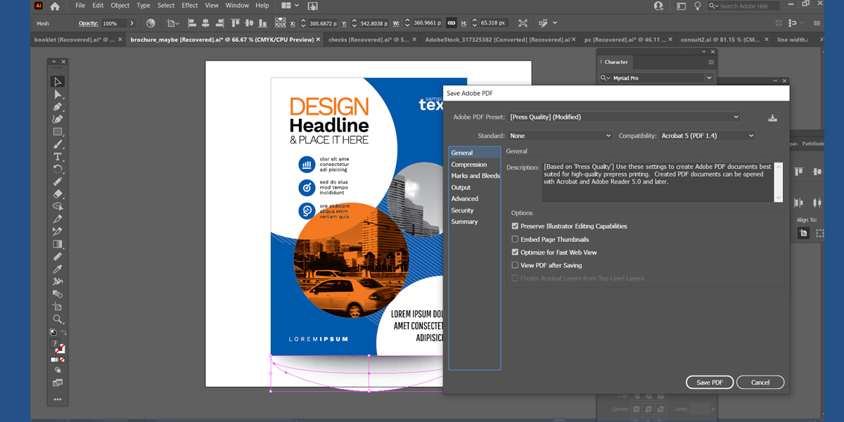
- Select Export from the File menu to create a PDF.
Save Adobe PDF Preset as “Press Quality” and select Acrobat 5 (PDF 1.4) from the Compatibility drop-down menu.
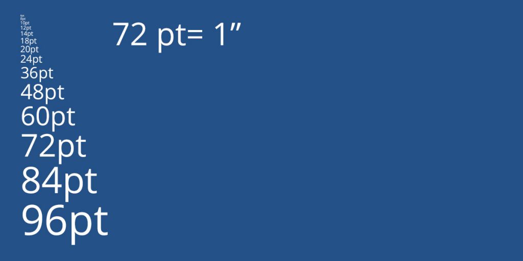
Please make sure you are using a font size larger than 7 pt. Type that is smaller than 7 pt can be difficult to read.
Also, with type smaller than 22 pt, using 3 or fewer CMYK colors will help to avoid misregistration.
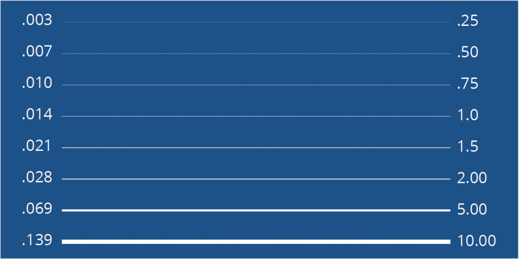
We strongly suggest setting your line thickness to at least .25 points (.003 inches) in width. A 1 or 2 point line is very popular and looks especially good around photographs.
The following chart highlights the most common line widths: